An advanced system for efficient gym management
Fizikal

Project Overview
Fizikal is a legacy CRM system for managing sports clubs, classes, and financial transactions. It underwent a full digital transformation, transitioning from locally installed software to a modern, responsive web platform. This transformation improved accessibility, flexibility, and workflows, enabling gym owners and staff to manage operations seamlessly from any device.
In this case study, I present two key flows I designed for Fizikal Web:
Receipt Creation Flow – within the Financial Module, streamlining transaction processing.
Activity Creation Flow – within the Activity Module, optimizing scheduling and class management.
Product Designer
Tools
Figma
Jira
Google Analytics
Team
Solo Designer
Year
2024
The Problem
The old system was inefficient and cumbersome, requiring users to navigate between multiple screens for both activity creation and receipt generation. The activity module lacked clear progress indicators and mobile support, making scheduling difficult and prone to errors. Similarly, the receipt module involved excessive manual input, lacked automation, and resulted in a 36% abandonment rate due to unclear UI and fragmented workflow. Additionally, both modules suffered from poor validation, leading to frequent user errors and increased support inquiries.
The Solution
We redesigned both workflows to be linear, intuitive, and mobile-friendly. The activity creation process was streamlined with a step-by-step wizard, real-time scheduling conflict detection, and a responsive design for seamless management. The receipt creation process was optimized with automated field suggestions, real-time error validation, and a 40% reduction in processing time. These improvements significantly enhanced efficiency, reduced user frustration, and minimized support inquiries by 52%.
Goals
Enhance User Experience
Simplify daily operations with an intuitive interface.
Ensure a Seamless Transition
Enable a smooth shift from the old system to the new one.
Reduce User Errors
Minimize mistakes with automated processes and intuitive design.
Improve Efficiency
Save time on common tasks.
The Process
The research involved user analysis, identifying challenges, and competitor benchmarking, focusing on improving user experience and workflows. Each stage included:

The Research
The goal was to identify the main pain points in the old system and user needs, focusing on improving accessibility, efficiency, and ease of use. Special emphasis was placed on upgrading the activity creation module and schedule management to make them smarter and more intuitive.
Research Methods
Conducted interviews with gym managers, instructors, and staff to understand existing workflows and daily challenges.
Performed competitor analysis, examining systems like Mindbody, Arbox, and Boostapp to learn about market solutions.
Observed users interacting with the old system to identify frustration points, particularly with activity creation and schedule management.

Participants
The research involved 15 participants, including managers, instructors, and staff members, representing a wide range of sports clubs to capture diverse needs.
"I have no way to see which paid campaigns work and which ones deliver results."
I spend too much time managing memberships and debts instead of focusing on daily operations
I wish the system could integrate simple automations like scheduled messages or payments via Bit
I need tools to understand which customers remain consistent and why others drop out."
82%
Of Fizikal users expressed a desire for a more accessible system, particularly on mobile.
67%
Of Fizikal users noted that the old system was time-consuming for managing activities and payments.
45%
Of gym managers reported difficulties managing data and creating efficient reports.
Wireframes
I designed the activity creation flow wireframes, divided into clear steps, based on the insights from my research


Final Design
The redesign of Fizikal focused on transforming an outdated desktop system into an intuitive, web-based platform. Each screen was crafted to simplify workflows, centralize data, and enhance usability across devices.
Login Screen
Simplified Access Across Devices
The login screen was designed for simplicity and efficiency, ensuring seamless access with minimal friction. Features include intuitive password recovery, clear instructions, and mobile accessibility. In the old system, the login flow was cumbersome, with no mobile access, limiting user flexibility.

Management Dashboard
Centralized Data for Insights
A centralized dashboard presents key metrics using graphs and charts, ensuring clarity and quick access to essential data. The old system lacked a central dashboard, with scattered data across multiple screens, making analysis slow and inefficient.


Weekly Schedule View
Clear Overview with Filters
The weekly schedule offers clarity and usability with advanced filtering, intelligent search, and easy navigation. Previously, the weekly view was cluttered, difficult to read, and lacked proper filtering options.
Daily Schedule View
Focused View by Time Slots
The daily schedule focuses on presenting activities organized by time slots, instructors, and locations, enabling quick decision-making and efficient navigation.

Activity Management – Activity List
Comprehensive Activity Overview
The activity management screen provides a centralized view of all scheduled activities, including instructors, locations, times, and statuses. Advanced filtering and search tools make it easy to locate and manage activities efficiently.

Instructor Replacement in Activity Management
Efficient Instructor Swap Process
The instructor replacement process includes real-time conflict checks for schedules and room availability, reducing errors and improving efficiency.

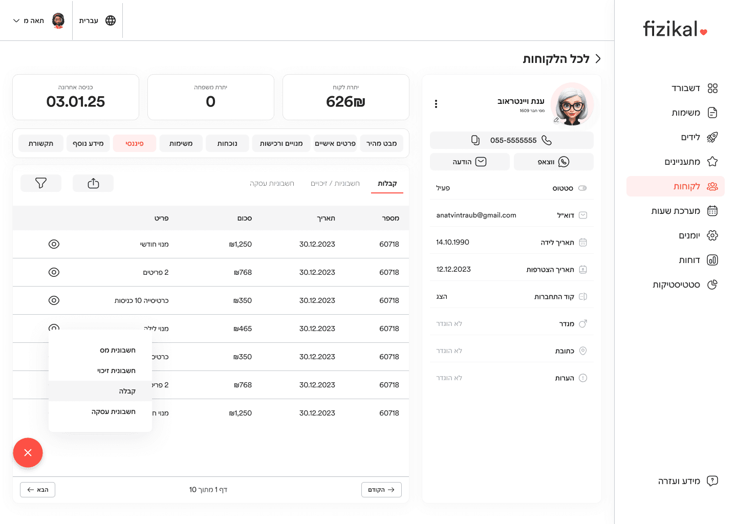
Customer Management Screen
Organized Customer Data Access

The customer management screen consolidates key customer information into a clear and organized interface. Advanced filtering and quick actions streamline operations. In the old system, customer data was displayed in dense, cluttered tables with limited filtering options.
Customer Card – Quick Overview
Quick Access to Key Details
The customer card provides an organized snapshot of key details, including financial information, communication tools, and activity history. Previously, information was scattered across multiple sections, creating a fragmented experience.

Customer Financial Overview
Track Payments and Transactions Seamlessly
Easily manage customer invoices, receipts, and financial transactions in one structured and intuitive interface. Gain full visibility into payment history and financial status at a glance.

Receipt Creation
Quick and Transparent Payments
The receipt creation process is streamlined with clear input fields, multiple payment options, and transparent summaries. In the old system, receipt creation was slow, manual, and lacked flexibility.


Colors
Fiery Red
#f44336
CTAs
Focused/Active states
Charcoal Gray
#212121
Overlays
Shadows
Headings
Dark
SLATE
#323232
Body text
Text
Pale Silver
#E8E8E8
layaout
nevigator
stone
#707070
Accent color
Hairlines
Subtle backgrounds
BORDERS
Soft Mist
#F5F5F5
backgrounds
Backgrounds
Typography
Header 1
Family:Circular20
Weight: medium
Size: 30px
Letter Spacing: -2%
Subtitle
Family:Circular20
Weight: Medium
Size: 18px
Body
Family: Circular20
Weight: Light
Size: 16px
Body
Font Weight: Bold
input text
Family: Circular20
Weight: light
Size: 16px
hint
Family: Circular20
Weight: light
Size: 14px
Letter Spacing: 3%

